

Choosing the right chart for your Power BI reports
So your company has lots of good data that can be used for business decisions, the BI team started building a dashboard, but when management looks at the dashboard they are confused and can’t really see any business value in those colourful reports.
Data visualization is all about storytelling; if the data is out of context, the story might be unnoticed.
So how do we choose the right graph or chart for our Power BI dashboard?
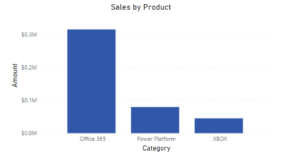
Bar chart
Bar charts are among the most frequently used chart types, and its simply because it’s easy on the eyes. With bar charts, the user can quickly identify which bar is the highest or the lowest, including the incremental differences between bars, its also a good way to illustrate both positive and negative values in the dataset. Use a Bar chart when you want to present the development or performance of a category. It’s best to have a limit of 5 categories to compare in most cases.
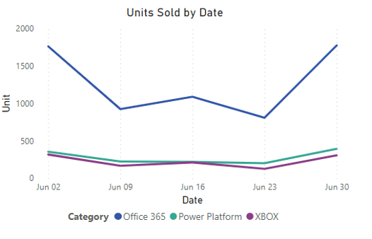
Line Chart
This type of chart is the best solution for analyzing and illustrating trends in data over time: it is very easy to read, and the user doesn’t feel overwhelmed or lost in data. Use this chart if you want to track the development of several variables at the same time. For example, analyzing year-over-year profit, department growth and even sales data over months, quarter, or years. It’s best to limit the number of lines to five or fewer to maximize visual comprehension.
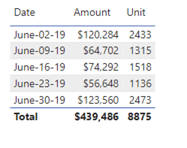
Tables
Use tables if you want to enable readers to look up specific information or exact values. Readers will be able to find details and go deeper into the data based on the information they gathered from the charts. Use tables when your data cannot easily be presented visually, or when the data requires more specific attention. Don’t use table if you want to find trends or compare data sets.
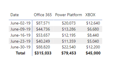
Matrix Tables
A matrix chart is like an advanced table, it shows relationships between two or more variables in a data set. If you want to display data across multiple dimension (rows and columns) Matrix Chart is the best option.
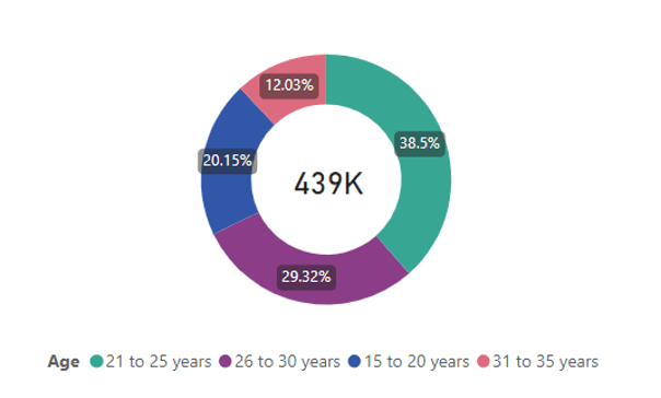
Donut chart
A donut chart, in its simplest form, is a pie chart, except it has a blank center and the ability to display information inside it. Many report developers avoid using Pie Charts because it is difficult to visually compare the proportional areas of the slices to one another and to the chart as a whole. This makes it tricky to see the differences between slices. Donut charts resolve this issue when the readers focus more on reading the length of the arcs, rather than comparing the proportions between the slices.
By choosing the best visuals in the right context in a Power BI report, your viewers can more easily understand the data and make decisions or discover insights about their business.
Thank you for reading this post! If you enjoyed it, I encourage you to check out some of our other content on this blog. We have a range of articles on various topics that I think you’ll find interesting. Don’t forget to subscribe to our newsletter to stay updated with all of our latest information on Microsoft BI.

discover more

5 Software Development Trends for 2024
In the last few years, we have witnessed unprecedented changes and advancements in technology, which have impacted the world of software development. These changes have presented organizations with additional opportunities…

Microsoft Fabric: OneLake Provides a Unified Data Lake
Have you been hearing the buzz about Microsoft Fabric? The Data Engineering and Business Intelligence team at Imaginet has been watching with interest the development of Fabric since it was…

Microsoft Loop: Seamless Co-Working in One Place
Years ago, Microsoft introduced digital collaboration with MS Word, Excel, Power Point, Outlook, and most significantly, MS Teams. Microsoft continues to push the boundaries with its innovations that reshape the…
Let’s Build Something Amazing Together
From concept to handoff, we’d love to learn more about what you are working on. Send us a message below or call us at 1-800-989-6022.